Fluorite Focus and Productivity App
A gamified way to stay on task and get things done!
Have you ever opened up your mobile device for a specific purpose, and ended up distracted from your original task at hand? Maybe you were studying for a test, or looking up an image to reference, or trying to check a to do list. Our phones have been designed so that everything we could want or need is at the touch of a fingertip, but what happens when digital distraction gets in the way of our productivity and daily tasks? I teamed up with my college, Amanda, to explore a way to utilize common distractions such as gamification and social aspects to rewire the brain so that being productive is fun, motivational, and anxiety free. We aim improve productivity apps so that digital distractions are lessoned and productivity is increased.
Overview: What is Fluorite Focus and productivity app?
With my teammate, we have spent approximately 3 months conceptualizing an app that utilizes gamification to encourage focus and productivity. Fluorite is a mobile app targeted towards Gen Z smartphone users, which encourages the users to focus on tasks by growing and earning new crystals, as well as encouragement through social pressure. Due to Tiktok trends, mysticism and crystals are an ever-growing trend with Gen-Z. This user group is also very focused on mental health and wellness, and particularly how spirituality, mysticism, and crystals can improve one’s mental health and wellness. Unfortunately, growing up with smartphones has lead to certain focus problems. We have combined Gen Z’s interest of crystals and mental health and wellness to make an app that caters to user’s personal needs while keeping them interested through gamification. feel free to read more about the app or scroll to the bottom of the page to see the final product!
Process and Methodology
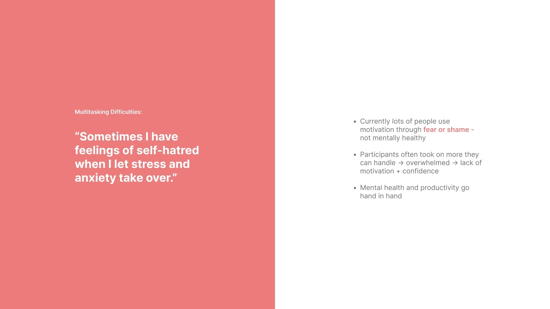
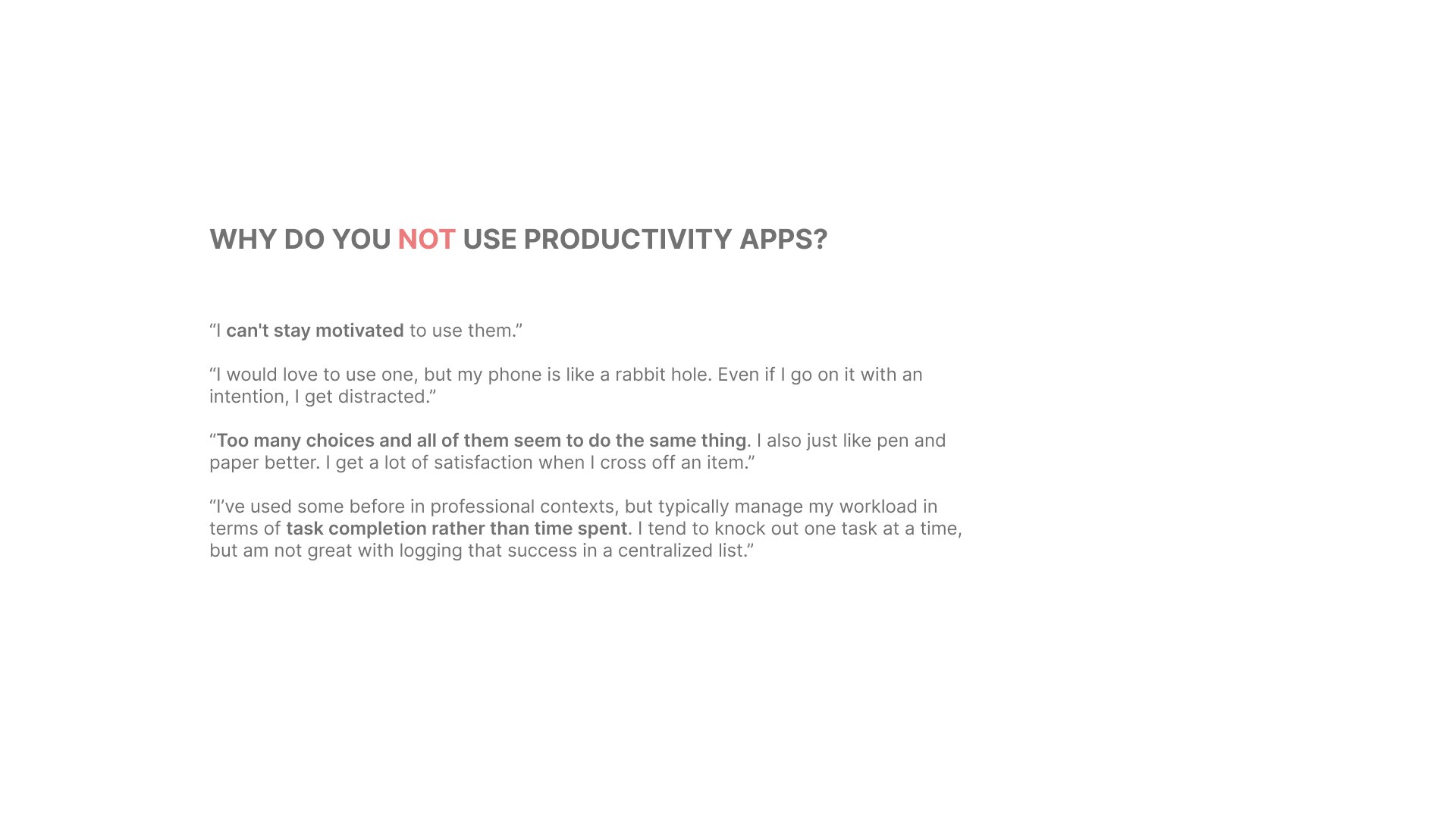
We started our process by conducting secondary research and identifying opportunities within the productivity app space. From there, we identified our target user group, Gen Z, and conducted a survey to better understand our potential users. We received 30 responses and from those 30 responses we were able to gather 6 participants to conduct interviews with. The purpose of these interviews was to better understand pain points and elements that our users liked regarding productivity apps and focusing in general. We were able to identify 6 different “types” of procrastinators, the two most common being The Perfectionist and The Crisis Maker. After analyzing our results from the interviews and surveys, not only we noticed a direct correlation between mental health and productivity, but we were also able to identify the wants, needs, and challenges of our potential users regarding productivity. Many users mentioned that productivity apps currently have “faceless” designs and no personality. Other users mentioned how they need elements to keep them calm while dealing with overwhelming anxiety. So, we created two user personas to help us better visualize our users and keep them in mind while designing: Kiana and Marc (pictured in slide deck below).

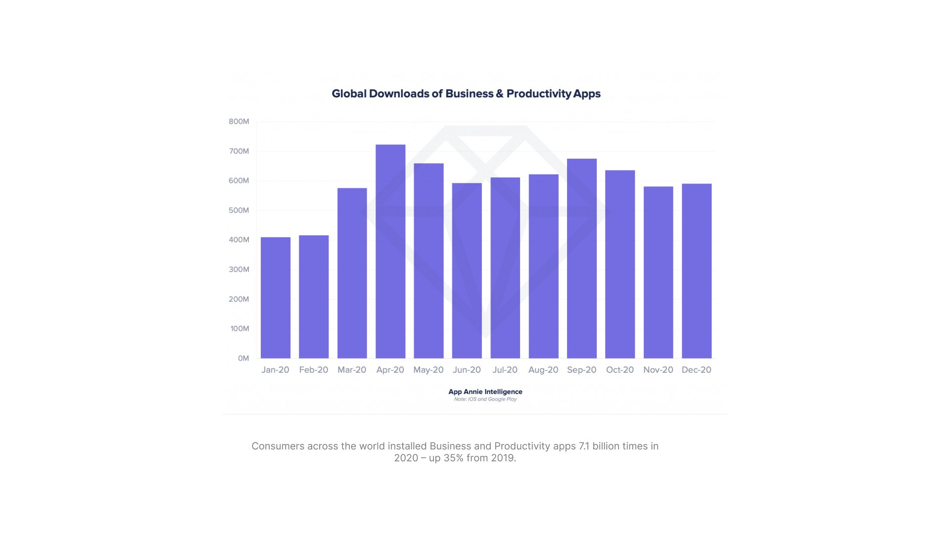






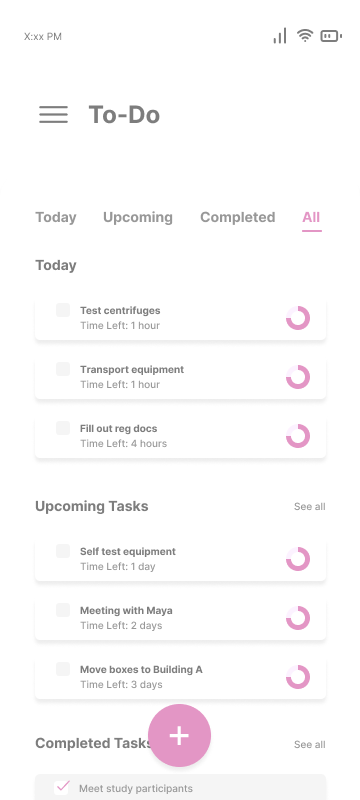
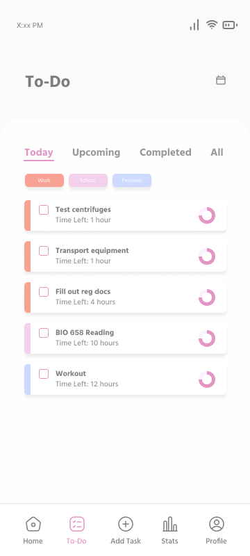
Before Designing, we made sure to conduct a competitive analysis, pictured in the gallery below. From there, we created an affinity board on Figjam to organize all the information from our research thus far, including ideas for solutions. This lead us to try out the crazy 8’s method (pictured in slide deck above) for brainstorming our app in a solution-based way, rather than design. Afterwards, we were ready to design, starting with lo-fi wireframes (pictured in slide deck above), then a site map and user flow map, and then hi-fi wireframes. We used our hi-fi wireframes to conduct user testing, where we brought in 5 participants— all of which had been participating in either the previous survey, interview, or both. User testing allowed us to identify any improvements we could make with our design as well as any improvements on the app’s functionality. After identifying improvements that needed to occur, we implemented our changes and added to our user flow.
High Fidelity Wireframes
(closer images of the Affinity INsight Board)
Lastly, after solution-based designing, we focused on the visual design and personality of our app. We curated 5 mood boards based off of 5 keywords that we identified, describing the look, feel, sound, smell (figuratively of course), etc. of our app, and then combined all of them to make one main mood board. There were still visual improvements within our app that needed to be made to fully reflect the mood boards we created, so we were sure to reflect those in our final steps towards our final product.
Final Steps towards Final product
First Iteration
Second iteration
In this iteration, we were experimenting with ideas that better reflected our mood board, so there is a lot of variation in aesthetic as we moved away from our original design.
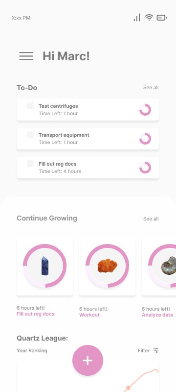
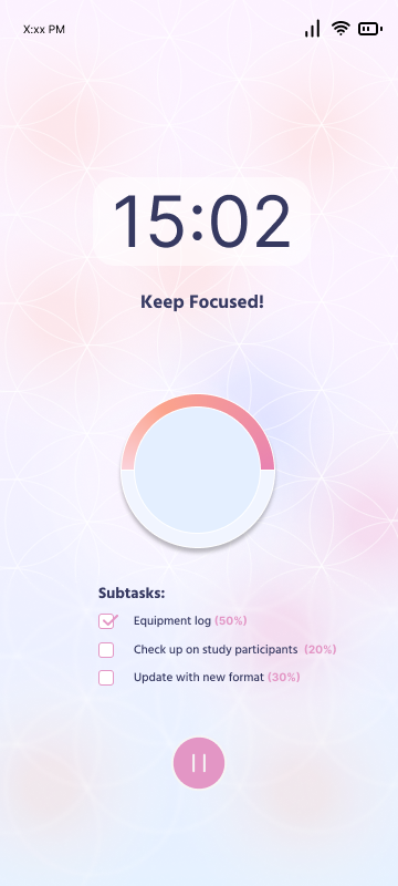
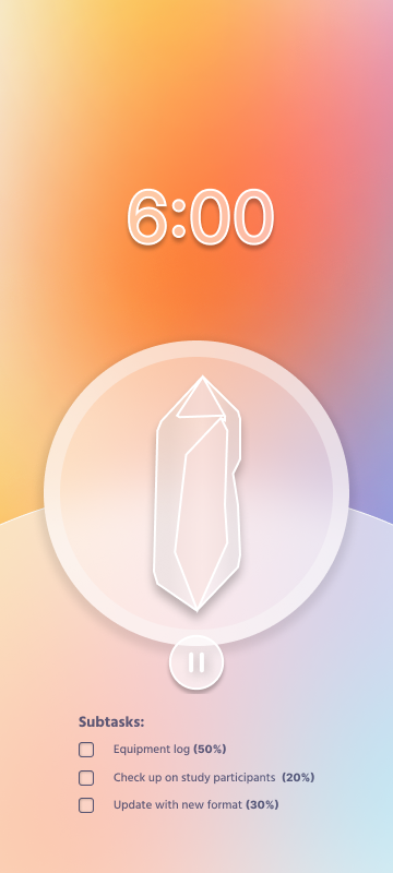
Lastly, before showing the final product, I would like to point your attention to the main motivation and the gamification for this focus app. These are just a few examples of how not only the crystals that users are growing look like but how time is kept track of in the focus section of the app. Our first iteration was just us figuring out what style of graphics we wanted to use and how time progression would work. Then, I went in and drew accurate depictions of each crystal that we wanted to showcase in our app preview. More on this will be showcased in the final product.
Visualizing the crystals that users are growing
Final product
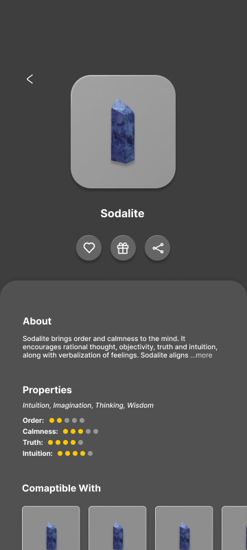
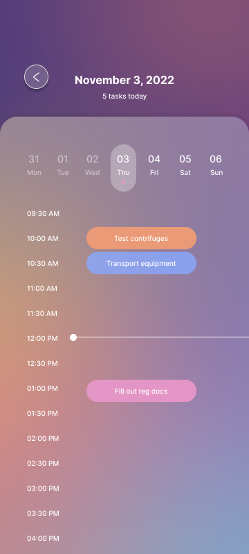
I would like to officially present to you Fluorite Focus, and app that allows you to grow a digital collection of crystals and connect and collaborate with others to reach your goals and set new ones for the future. Fluorite Focus makes productivity fun, even when your tasks feel mundane.
Please view the video below to view Fluorite Focus in action.
Fluorite focus comes in 3 different features which can be applied in the settings: Darkest, Dark (default), and light: see below.
Darkest
Darkest feature has the least color and leans more to a typical productivity app aesthetic for those who find the color distracting or unpleasant.
Dark
Dark is the default setting, which encapsulates a the mood boards we made during our design process. This setting resembles an aura or lava lamp, which many of our participants in our studies found calming and “so beautiful [they] wouldn’t want to touch [their] phone or get distracted.”
Light
We get it, not everyone wants dark mode. Some people prefer the light. And for those people, we have a bright and playful, yet calming visual experience.


